Cloud Dancer…White? Analyzing Pantone’s Color of the Year
Written by Clara Dellenbaugh
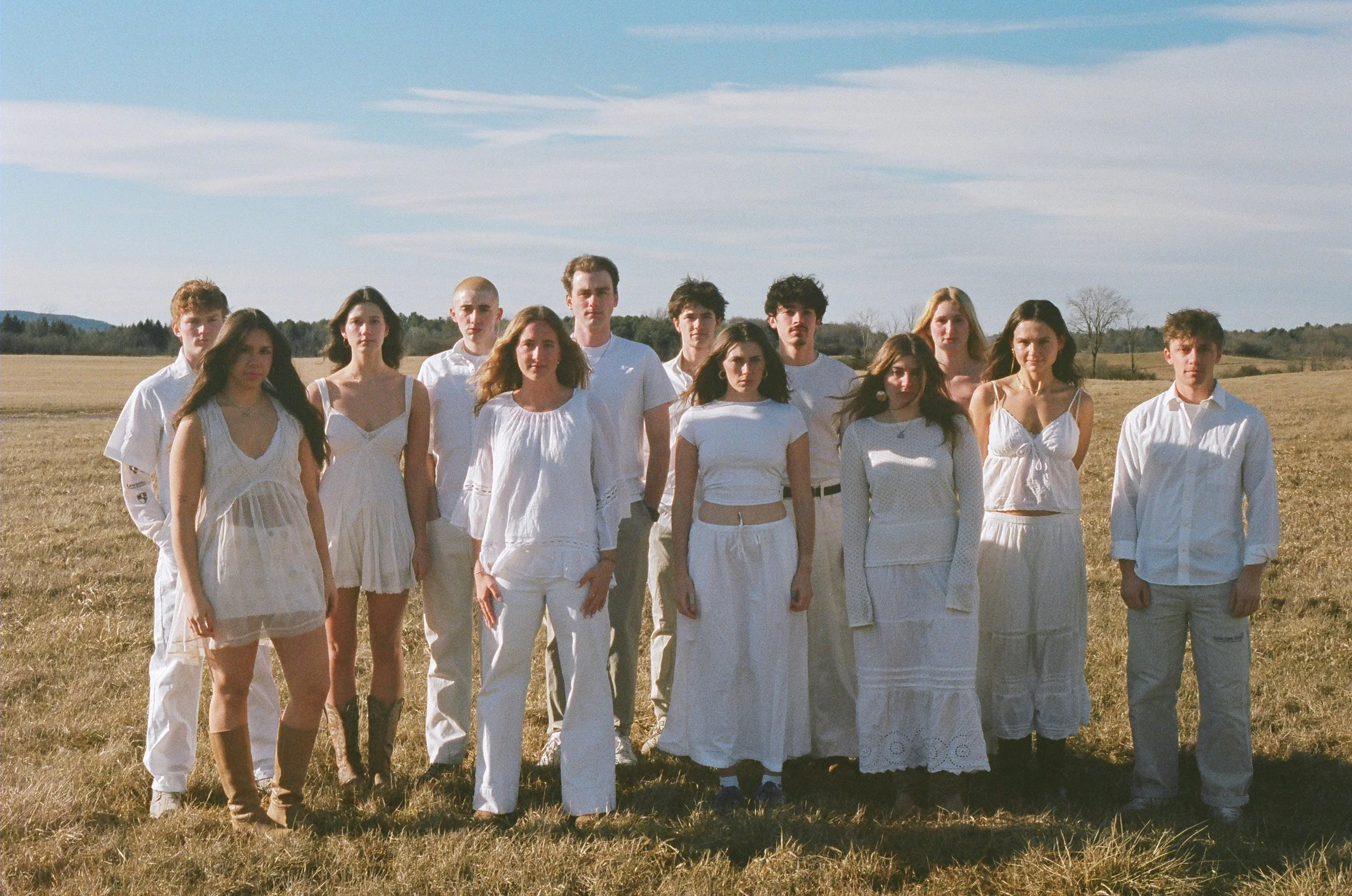
Photo by Willa Sullivan
Color sits at the center of every conversation surrounding fashion, design, and art. It’s a focal point in any creative decision and a vital tool for expressing global culture. This relationship between color and culture is what the Pantone Institute seeks to explore when selecting an annual Color of the Year.¹ In the past, color selections have often been bold and unique, with interesting commentary attached. Unsurprisingly, then, Pantone caught the attention of many this past December when they announced 2026’s Color of the Year: Cloud Dancer—a neutral shade of white.
The Pantone Institute first established Pantone Color of the Year in 1999. The program was created to encourage conversation about color among the design community, with the goal of highlighting what is taking place in our global culture and how it is expressed through color.² During selection, Pantone’s team of experts search for inspiration among a wide variety of influences, including design, fashion, art, entertainment, and technology. The emotional aspect of color—the idea that color can be closely tied to specific feelings—is also heavily considered. “Anything and everything taking place in our culture during the year”³ can influence the decision, writes Pantone Color Institute Vice President Laurie Pressman. The selection process entails a thorough analysis of macro-level trends, looking at color not just from the perspective of one country or culture, but from many. Essentially, the goal is to select a color that conveys a global zeitgeist—one that resonates with many while also inspiring creative thought.⁴
Past examples mirrored intentional thought within a broader cultural context. In 2009, they announced Mimosa as the Color of the Year. A deep yet soft yellow-orange, this shade was intended to represent warmth, hope, and optimism, characteristics they deemed “paramount”⁵ in the wake of economic recession. 2016 marked the first time that two colors were selected in one year: Rose Quartz (a pastel pink) and Serenity (light blue). These shades were chosen intentionally in response to the increasing “gender blur”⁶ in fashion, coinciding with greater social movements toward gender equality and fluidity. While these choices reflect creative design aspirations for each year, they aren’t made in a vacuum. It’s clear that Pantone works to incorporate political and social trends in each year’s decision.
So, what is the reasoning behind selecting Cloud Dancer as 2026’s Color of the Year? The Pantone Institute describes the present as a time of “24/7 hustle culture”⁷ where we are bombarded by conflicting messages and overstimulation. Cloud Dancer, they argue, offers respite from distractions and the opportunity to find “clarity and simplicity”.⁸ The shade is intended to serve as a symbol of tranquility in a society overflowing with chaos and noise. Pantone emphasizes its role as a calming presence, offering a sense of relief from the busy world around us. This choice demonstrates a shift toward minimalism; Vogue describes it as indicative of society’s collective “search for purity.”⁹ Indeed, Cloud Dancer is already prominent on the runway: the natural white shade has been featured in a variety of spring 2026 shows. Calvin Klein, Dior, Balenciaga, and Heirlome all displayed monochromatic white looks in a range of styles and silhouettes.¹⁰ While it may not be a color that “rocks the boat,” it can certainly be interpreted in diverse ways across the industry.
Since the announcement in December 2025, Cloud Dancer has sparked an onslaught of criticism. Many feel the choice is insensitive or inaccurate in today’s political and social climate, given that Pantone supposedly takes into account all aspects of culture when electing their Color of the Year. Critics labelled the decision “Pantone-deaf”¹¹ against a background of rising white nationalism, conservatism, and purity culture. The most condemnatory argue that it is impossible to separate fashion from politics, and the shade reads as ignorant at best, a “white supremacist dog-whistle”¹² at worst. Aside from Cloud Dancer’s potential societal implications, the resounding opinion on the color is that it simply does not offer anything new. With no leanings towards warm or cool, Cloud Dancer is an absolute neutral. So neutral, in fact, that voices online critique its blandness, labelling the color “landlord white” and comparing the color swatch to unseasoned chicken.¹³
Cloud Dancer doesn’t necessarily offer any groundbreaking commentary on how design will evolve. While it may be that this shade of white is popular in fashion or artistic movements at the moment, there is nothing particularly exciting about an incredibly neutral white. This is a color that has long existed in all aspects of design. It is an agreeable tone, yet it lacks substance as a marker of trends and shifting culture, as evidenced by Pantone’s somewhat vague emphasis on “tranquility.” Therefore, it serves essentially no purpose as Color of the Year. In today’s social climate, the color reads to many as downright insensitive. However, there is always the possibility that Cloud Dancer was intentionally chosen to garner such attention. Given the level of conversation that has erupted around 2026’s Color of the Year in comparison to other recent years, could it be that the Pantone Institute intentionally selected this shade to stir the pot? Regardless, Cloud Dancer has certainly ignited discussions about the relationship between design and culture that will undoubtedly cast greater attention onto Pantone’s future color selections.
Endnotes:
1. Pressman, Laurie. “What is Color of the Year?” The Pantone Institute, 2023. https://www.pantone.com/articles/color-of-the-year/what-is-color-of-the-year?srsltid=AfmBOopLM--BweVU8s8CJO0scrAZpdKMmo5iwsZjzv3G5Vq7MlLLj1k7.
2. Pressman, “What is Color of the Year?”
3. Pressman, “What is Color of the Year?”
4. Mac Donnell, Chloe. “Clouded judgment? Why Pantone’s colour of the year is causing controversy,” The Guardian, 2026. https://www.theguardian.com/fashion/2026/jan/08/clouded-judgement-why-pantones-colour-of-the-year-is-causing-controversy.
5. Carlstadt, N.J. “Pantone Selects Color of the Year for 2009: PANTONE 14-0848 Mimosa.” The Pantone Institute, 2008. https://www.pantone.com/articles/press-releases/pantone-selects-color-of-the-year-for-2009-pantone-14-0848-mimosa?srsltid=AfmBOooAThl-uC9s8_hM-sOrosNIqN_XAK5YPbAR8XyLho4ROqzS9JTX.
6. “Pantone Color Of The Year 2016: PANTONE 13-1520 Rose Quartz & PANTONE 15-3919 Serenity.” The Pantone Institute, 2015. https://www.pantone.com/articles/color-of-the-year/color-of-the-year-2016.
7. Pressman, Laurie. “The Story of Pantone Color of the Year 2026.” The Pantone Institute, 2026. https://connect.pantone.com/?utm_source=pantone.com&utm_medium=coylanding&utm_campaign=pantone+connect&utm_content=read+the+full+story/#/color-insider/the-story-of-color-of-the-year-2026.
8. Pressman, Laurie. “The Story of Pantone Color of the Year 2026.”
9. Garcia-Furtado, Laia. “The 2026 Pantone Color is ‘Cloud Dancer,’ A Natural White.” Vogue, 2025. https://www.vogue.com/article/pantone-color-of-the-year-2026-cloud-dancer
10. Laia. “The 2026 Pantone Color is ‘Cloud Dancer,’ A Natural White.”
11. Mac Donnell, Chloe. “Clouded judgment? Why Pantone’s colour of the year is causing controversy”.
12. Mac Donnell. “Clouded judgment? Why Pantone’s colour of the year is causing controversy.”
13. Hernandez, Arlyn. “The Internet Has Feelings About Pantone’s Color Of The Year… Let’s Discuss”. Style by Emily Henderson, 2025. https://stylebyemilyhenderson.com/pantones-color-of-the-year-controversy.